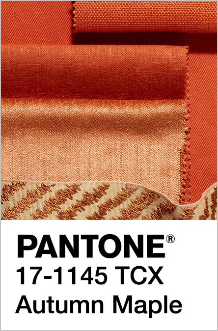
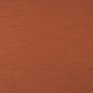
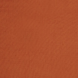
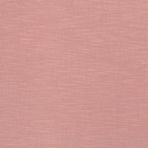
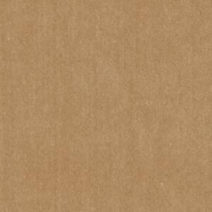
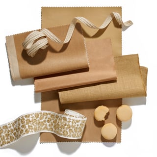
We love Autumn Maple as a color for Fall because it brings the warmth of the season into our design palette. From pumpkins to leaves, this color reminds us of the cooler months - it's a classic.
"A quintessential autumn color, Autumn Maple is tawny and russet, introducing warmth into the palette." [source]
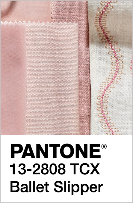
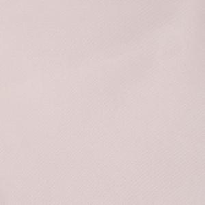
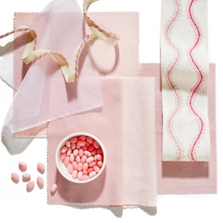
Ballet Slipper, similar to
"Descended from the red family but with a softer touch, Ballet Slipper is always flattering and reminiscent of the rosy glow of health" [source]
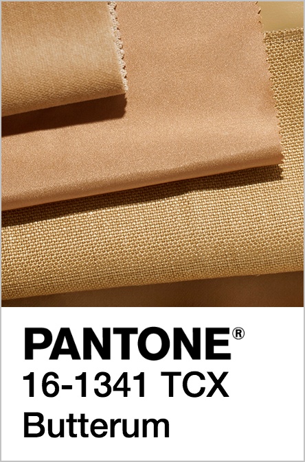
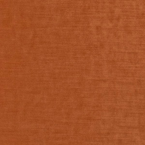
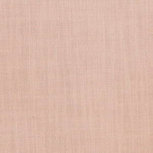
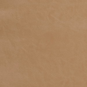
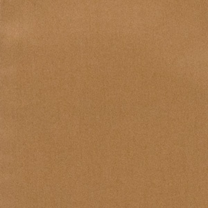
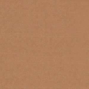
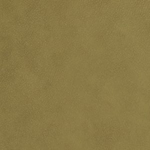
How gorgeous is Butterum for Fall? It's a great muted caramel that goes well with crisp whites, moody blues, as well as so many other colors that are perfect for fall decor. We love it in both upholstery as well as in easy-to-update accents like pillows and accessories.
"This snug, warming, and toasty shade is evocative of drinking a glass of Butterum by a roaring fire on a cool autumn evening." [source]
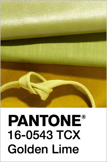
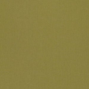
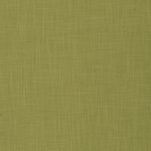
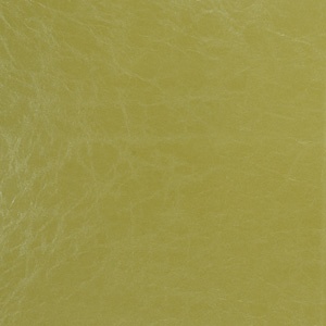
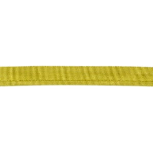
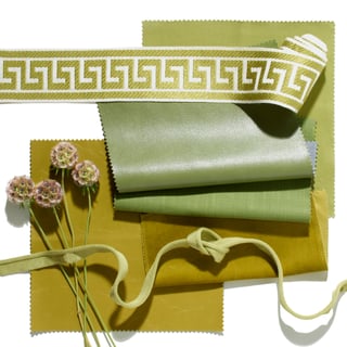
Golden Lime is the sister of chartreuse, which means we cannot get enough of it! This vibrant yellow-green is wonderful as an accent paired with the neutral browns and grays of the season.
"Earthy tones with a twist, the golden undertones of Golden Lime makes this yellow-green shade a refreshing complement to fall classics." [source]
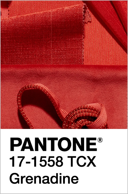
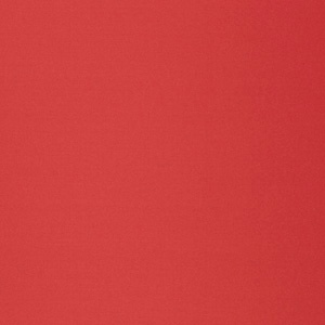
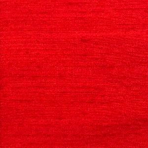
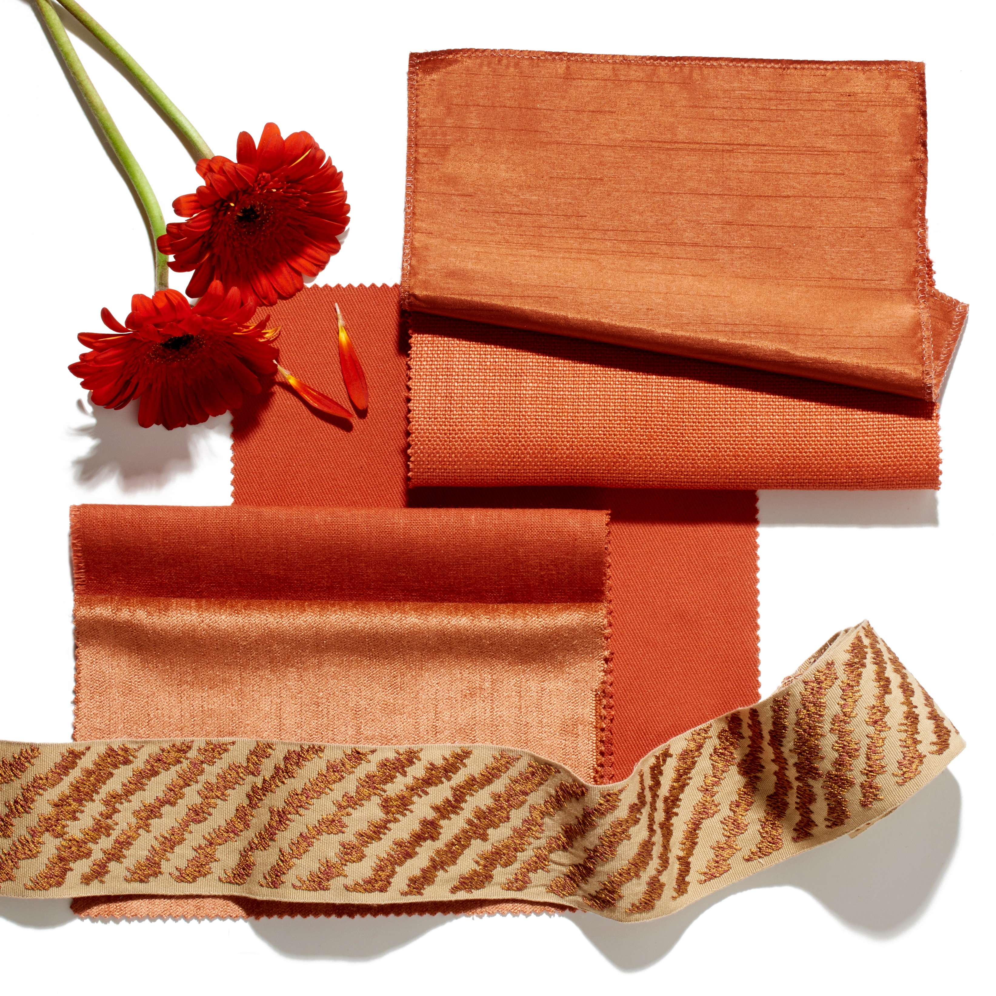
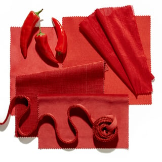
We love Grenadine for Fall because it is so full of vibrant color that is perfect for the holiday season. From winter berries to cold-weather florals, this color is the perfect shade to inspire warmth and spice into fall designs. We love it paired with warm whites and silver accents!
"A powerful, evocative, dynamic red, Grenadine is a confident and self-assured attention-getter." [source]
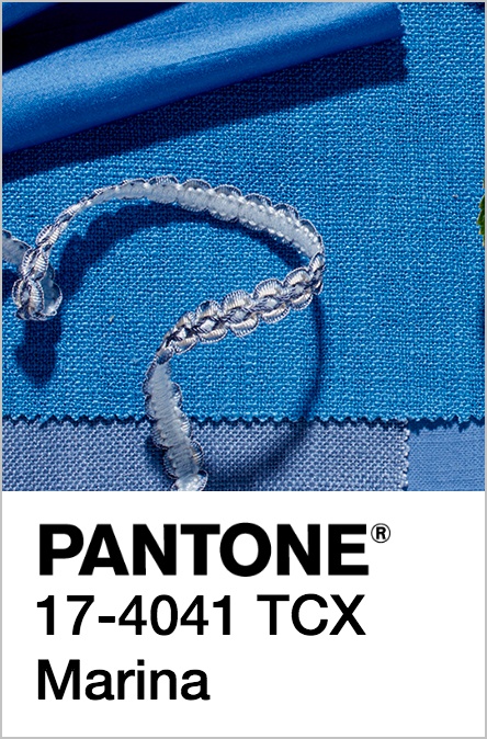
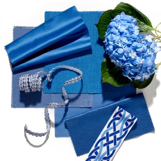
Marina could be our favorite shade of blue! It's the perfect mix of sapphire and royal blue - and we love that it can translate easily into spring. It's vibrant enough to be used in the winter months alongside both neutrals and bright palettes alike.
"Cool with an enhanced vitality, Marina is the only truly cool color in the fall palette that brings with it freshness and brightness." [source]
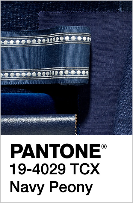
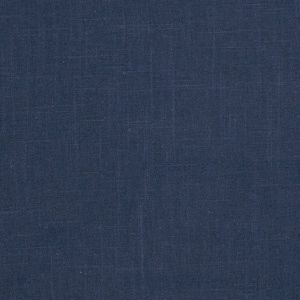
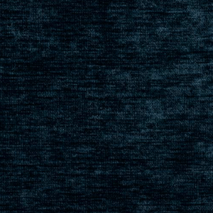
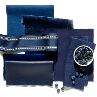
When we saw that Navy Peony had been chosen for the Pantone Fall Fashion Report, we were thrilled! This color is such a wonderful refresh on
"A mainstay
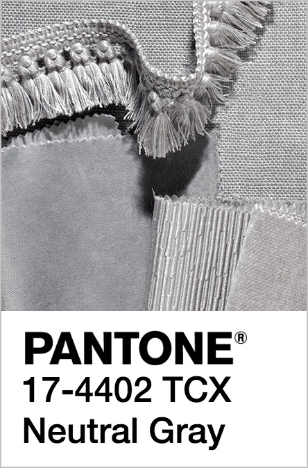
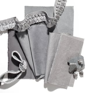
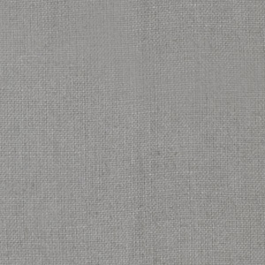
Another classic for the winter months is this Neutral Gray. It's perfect for Scandinavian-inspired designs and classic homes alike. We love this color because it's a perfect mid-point between heather and slate gray - two of our favorite hues.
"The standard bearer of all neutrals, Neutral Gray shares the anchoring role with Navy Peony in this palette. It can be used as an accent or a head-to-toe statement shade." [source]


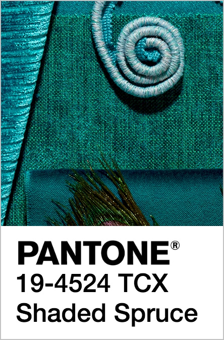
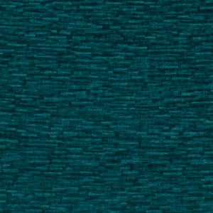
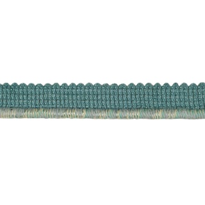
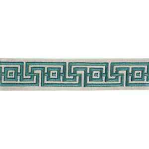
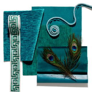
Shaded Spruce is a gorgeous addition to the fall palette - coming from both the turquoise and emerald color families, this jewel tone is an amazing show-stopper for extravagant designs. We love seeing it paired with grays, corals, and caramel-toned leathers.
"This is a green you might see in the forest – sheltering and protective as evergreen trees." [source]
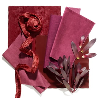
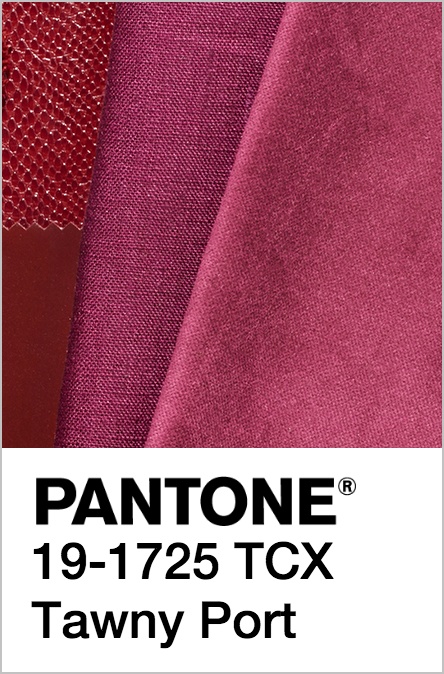
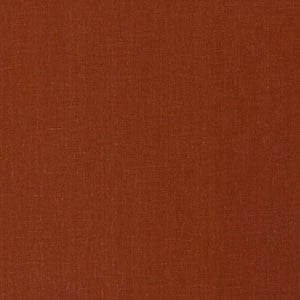
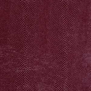
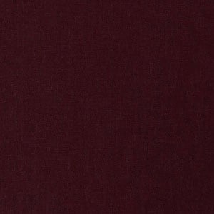
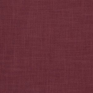
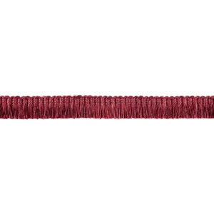
Pantone's Fall palette wouldn't be complete without Tawny Port. It's a beautiful shade that reminds us of long dinner parties filled with laughter, wine, and great conversation. This color can be paired with jewel tones and neutrals alike - and we can't get enough of it in our own homes!
"Taking the red family to new depths, Tawny Port is elegant, sophisticated, and tasteful." [source]